Volume 2 Kickstarter Progress
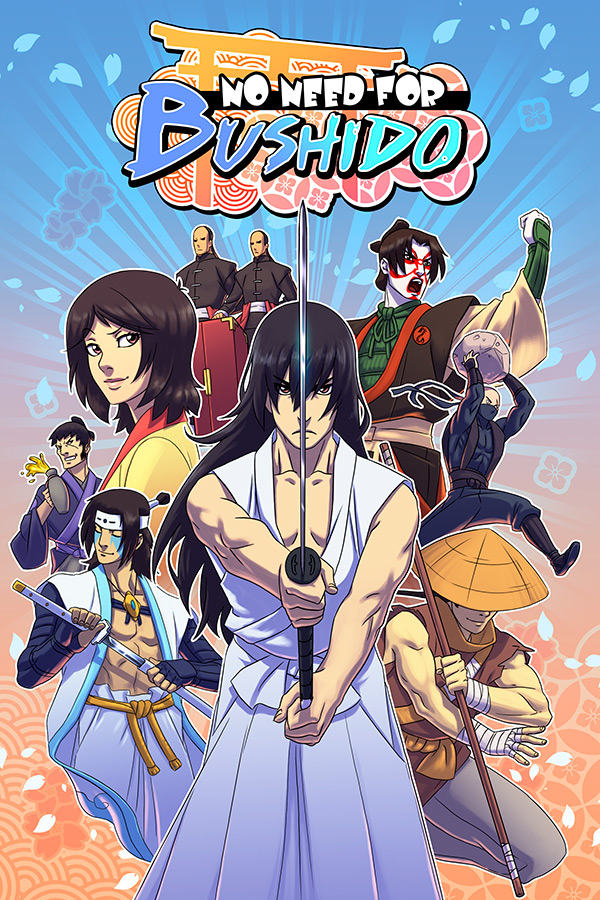
We’re rapidly approaching the launch of our Volume 2 Kickstarter! Joe’s working out the financial details to determine our ideal monetary goal, but we’ll have an exact number soon enough. We’re intending to launch the kickstarter NEXT WEEK, fingers crossed. Tell your friends! We’re currently editing together our video pitch, which is going to have a rad semi-animated opening bit, and I have some completed Volume 2 cover art to show! I tried to incorporate characters from most of the big scenes that will be in in the book. I realize the bandits are conspicuously absent, but I’m sure they’ll be prominently displayed on Volume 3. I also included our new logo logo designs, which I think really pop much better than the old version.
![]()
Published on by Alex Kolesar | 8 Comments on Volume 2 Kickstarter Progress
I know it’s not my place but I strongly urge you to set the deadline waaaay down the road the more time you give this kick starter the more chances people can give you guys money, You guys already have day jobs so you can take as much time as you need to wait until your goal is reached.
Generally speaking, most kickstarters get their backers at the beginning and end of a campaign. The middle bit is usually a long slow slog with very less contribution. For a campaign like this, going a full 2 months might be overkill, but we’re still debating the length.
Alex, while I like the design for the logo with the Shinto arch, have you considered a different color palette there? What you have seems pretty subdued. Putting that arch into a deep red would help, and maybe not going with the pastel blues in the text.
Or just ignore me, guess it’s rather presumptuous to give an opinion like that, heh. Part of my job involves design and art direction, so it just comes out sometimes.
I would not presume to be a master of color theory be a long shot. If you copied the image into photoshop and mocked up a stronger color scheme, I certainly wouldn’t be above adapting it!
I’ll try to sneak it in tomorrow and see if I can do that.
Ok, here’s a couple of thoughts…apologies in advance, I couldn’t really recreate the nice gradiated transitions in PS in the time I had. I understand the pastel palette in the background conveying the idea of cherry blossoms, but for major elements like the text and the arch it seemed like a more dark, solid color would stand out better. The top one is a slightly darker red arch and solid blue on the text, while the bottom one is a bit closer to what you had (although you’d want to re-do the transitions on the shading).
Good luck with it, will be supporting your Kickstarter!
I tried variations on this color combination, and changing the background patterns’ colors. I did darken the shinto arch a bit, which does look better. Making it a stark red, and making the text a darker navy blue, though, I’m not as sold on, as I’m pretty happy with the colors already picked out.
Okie dokie, glad to have shared a few ideas.